Python for Computing
Python for Computing
There are many online resources for learning Python. A good place to start is the documentation provided by the Python Software Foundation, located here: https://www.python.org/doc/
This chapter focuses on how to use Python within a Jupyter notebook. Doing simple calculations in Python is very straightforward. However, once you try to do something complex, there are a few tricks to learn. In particular, how to get plots to appear in the notebook, how to do animations, and a few other niceties.
Python 2 or 3
Use Python 3, please.
Plotting in a Python notebook
Three things before you can plot.
- you tell Jupyter that you want plots to appear inline
- you load in numerical Python so you can deal with numerical arrays
- you load in PyPlot to do your plotting.
This is done with the following code:
%matplotlib inline
import numpy as np
import matplotlib.pyplot as plt
You don’t need to use the “as np” or the “as plt” but it helps to keep the namespace clean. So when you call functions like “sin” you need to say where it comes from, as in “np.sin”
Now, to plot a few numbers, you just call the plot function, with the numbers as an array:
plt.plot([1,4,9,16,25])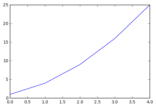
You can plot a piece of the sine function in a similar manner, passing a list of numbers to the sin function:
plt.plot(np.sin([0,.1,.2,.3,.4,.5,.6,.7,.8,.9,1.0]))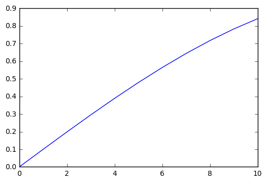
Usually you want to plot x and y values together, which you can do as follows:
x = [0,.1,.2,.3,.4,.5,.6,.7,.8,.9,1.0,1.1,1.2,1.3,1.4,1.5,1.6];
y = np.sin(x);
plt.plot(x,y)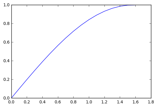
Animating Plots
We can use html5 for animation, as suggested in this web page.
This seems to be the modern way to do animation in Python.
First step is to initialize some things in Python.
- we need %matplotlib inline to get things to plot right on the notebook
- we need numpy for the math
- we need matplotlib for plotting
- we need animation from matplotlib, and HTML from iPython.display to show the animations
We get all these with the following imports:
%matplotlib inline
import numpy as np
import matplotlib.pyplot as plt
from matplotlib import animation, rc
from IPython.display import HTML
We now have four steps to get an animated plot
- set up the figure frame
- define the initializing function
- define the function that draws each frame of the animation
- call the animator function, which creates all the frames and saves them for you
Then we are ready to call “HTML” to display the animation.
# First set up the figure, the axis, and the plot element we want to animate
fig, ax = plt.subplots()

ax.set_xlim(( 0, 2))
ax.set_ylim((-2, 2))

line, = ax.plot([], [], lw=2)
# NOTE: THIS WILL DISPLAY JUST AN EMPTY BOX.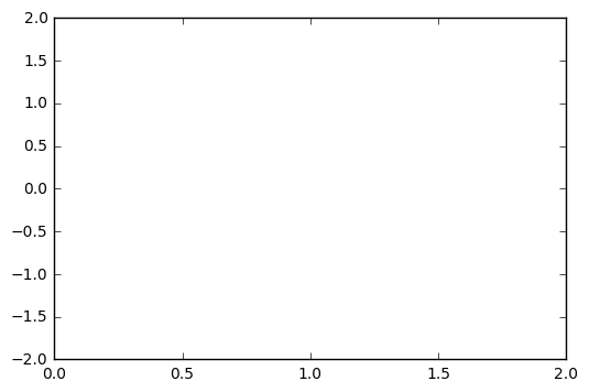
Initialization function: plot the background of each frame
def init():
    line.set_data([], [])
    return (line,)
Animation function. This is called sequentially
def animate(i):
    x = np.linspace(0, 2, 1000)
    y = np.sin(2 * np.pi * (x - 0.01 * i))
    line.set_data(x, y)
    return (line,)
Call the animator. blit=True means only re-draw the parts that have changed.
anim = animation.FuncAnimation(fig, animate, init_func=init,
                               frames=100, interval=20, blit=True)

HTML(anim.to_html5_video())Data Analysis
A simple demo with pandas in Python
This notebook is based on course notes from Lamoureux’s course Math 651 at the University of Calgary, Winter 2016.
This was an exercise to try out some resource in Python. Specifically, we want to scrape some data from the web concerning stock prices, and display in a Panda. Then do some basic data analysis on the information.
We take advantage of the fact that there is a lot of financial data freely accessible on the web, and lots of people post information about how to use it.
Pandas in Python
How to access real data from the web and apply data analysis tools.
I am using the book Python for Data Analysis by Wes McKinney as a reference for this section.
The point of using Python for this is that a lot of people have created good code to do this.
The pandas name comes from Panel Data, an econometrics terms for multidimensional structured data sets, as well as from Python Data Analysis.
The dataframe objects that appear in pandas originated in R. But apparently they have more functionality in Python than in R.
I will be using PYLAB as well in this section, so we can make use of NUMPY and MATPLOTLIB.
Accessing financial data
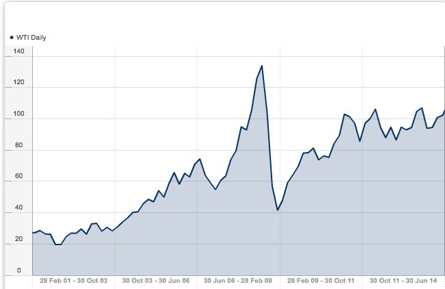
For free, historical data on commodities like Oil, you can try this site: http://www.databank.rbs.com This site will download data directly into spreadsheets for you, plot graphs of historical data, etc. Here is an example of oil prices (West Texas Intermediate), over the last 15 years. Look how low it goes…
Yahoo supplies current stock and commodity prices. Here is an interesting site that tells you how to download loads of data into a csv file. http://www.financialwisdomforum.org/gummy-stuff/Yahoo-data.htm
Here is another site that discusses accessing various financial data sources. http://quant.stackexchange.com/questions/141/what-data-sources-are-available-online
Loading data off the web
To get away from the highly contentious issues of oil prices and political parties, let’s look at some simple stock prices – say Apple and Microsoft. We can import some basic webtools to get prices directly from Yahoo.
# Get some basic tools
%pylab inline
from pandas import Series, DataFrame
import pandas as pd
import pandas.io.data as web
# Here are apple and microsoft closing prices since 2001
aapl = web.get_data_yahoo('AAPL','2001-01-01')['Adj Close']
msft = web.get_data_yahoo('MSFT','2001-01-01')['Adj Close']
subplot(2,1,1)
plot(aapl)
subplot(2,1,2)
plot(msft)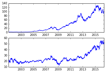
aapl


    Date
    2001-01-02      0.978015
    2001-01-03      1.076639
    2001-01-04      1.121841
    2001-01-05      1.076639
    2001-01-08      1.088967
    2001-01-09      1.130060
    2001-01-10      1.088967
    2001-01-11      1.183481
    2001-01-12      1.130060
    2001-01-16      1.125950
    2001-01-17      1.105404
    2001-01-18      1.228683
    2001-01-19      1.282104
    2001-01-22      1.265667
    2001-01-23      1.347853
    2001-01-24      1.347853
    2001-01-25      1.310869
    2001-01-26      1.286213
    2001-01-29      1.425930
    2001-01-30      1.430039
    2001-01-31      1.421820
    2001-02-01      1.388946
    2001-02-02      1.356072
    2001-02-05      1.327306
    2001-02-06      1.388946
    2001-02-07      1.364290
    2001-02-08      1.364290
    2001-02-09      1.257448
    2001-02-12      1.294432
    2001-02-13      1.257448
                     ...
    2016-05-04     93.620002
    2016-05-05     93.239998
    2016-05-06     92.720001
    2016-05-09     92.790001
    2016-05-10     93.419998
    2016-05-11     92.510002
    2016-05-12     90.339996
    2016-05-13     90.519997
    2016-05-16     93.879997
    2016-05-17     93.489998
    2016-05-18     94.559998
    2016-05-19     94.199997
    2016-05-20     95.220001
    2016-05-23     96.430000
    2016-05-24     97.900002
    2016-05-25     99.620003
    2016-05-26    100.410004
    2016-05-27    100.349998
    2016-05-31     99.860001
    2016-06-01     98.459999
    2016-06-02     97.720001
    2016-06-03     97.919998
    2016-06-06     98.629997
    2016-06-07     99.029999
    2016-06-08     98.940002
    2016-06-09     99.650002
    2016-06-10     98.830002
    2016-06-13     97.339996
    2016-06-14     97.459999
    2016-06-15     97.139999
    Name: Adj Close, dtype: float64
Let’s look at the changes in the stock prices, normalized as a percentage
aapl_rets = aapl.pct_change()
msft_rets = msft.pct_change()
subplot(2,1,1)
plot(aapl_rets)
subplot(2,1,2)
plot(msft_rets)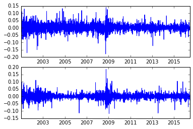
Let’s look at the correlation between these two series
pd.rolling_corr(aapl_rets, msft_rets, 250).plot()

    /opt/conda/envs/python2/lib/python2.7/site-packages/ipykernel/__main__.py:2: FutureWarning: pd.rolling_corr is deprecated for Series and will be removed in a future version, replace with
        Series.rolling(window=250).corr(other=<Series>)
      from ipykernel import kernelapp as app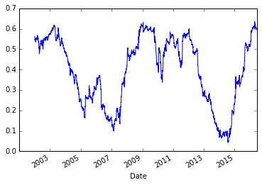
Getting fancy.
Now, we can use some more sophisticated statistical tools, like least squares regression. However, I had to do some work to get Python to recognize these items. But I didn’t work too hard, I just followed the error messages.
It became clear that I needed to go back to a terminal window to load in some packages. The two commands I had to type in were
- pip install statsmodels
- pip install patsy
‘pip’ is an ‘python installer package’ that install packages of code onto your computer (or whatever machine is running your python). The two packages ‘statsmodels’ and ‘patsy’ are assorted statistical packages. I don’t know much about them, but they are easy to find on the web.
# We may also try a least square regression, also built in as a panda function
model = pd.ols(y=aapl_rets, x={'MSFT': msft_rets},window=256)

    /opt/conda/envs/python2/lib/python2.7/site-packages/ipykernel/__main__.py:2: FutureWarning: The pandas.stats.ols module is deprecated and will be removed in a future version. We refer to external packages like statsmodels, see some examples here: http://statsmodels.sourceforge.net/stable/regression.html
      from ipykernel import kernelapp as app
model.beta| MSFT | intercept | |
|---|---|---|
| Date | ||
| 2002-01-14 | 0.796463 | 0.000416 |
| 2002-01-15 | 0.788022 | 0.000417 |
| 2002-01-16 | 0.789784 | 0.000191 |
| 2002-01-17 | 0.802081 | 0.000600 |
| 2002-01-18 | 0.793941 | 0.000671 |
| 2002-01-22 | 0.796478 | 0.000718 |
| 2002-01-23 | 0.797909 | 0.001172 |
| 2002-01-24 | 0.786143 | 0.000960 |
| 2002-01-25 | 0.781526 | 0.001102 |
| 2002-01-28 | 0.782449 | 0.001064 |
| 2002-01-29 | 0.782113 | 0.001196 |
| 2002-01-30 | 0.764488 | 0.001069 |
| 2002-01-31 | 0.784935 | 0.001246 |
| 2002-02-01 | 0.784775 | 0.001254 |
| 2002-02-04 | 0.774178 | 0.001252 |
| 2002-02-05 | 0.781460 | 0.001383 |
| 2002-02-06 | 0.781529 | 0.001354 |
| 2002-02-07 | 0.792091 | 0.001506 |
| 2002-02-08 | 0.785451 | 0.001019 |
| 2002-02-11 | 0.788570 | 0.001084 |
| 2002-02-12 | 0.793316 | 0.001001 |
| 2002-02-13 | 0.796715 | 0.001117 |
| 2002-02-14 | 0.796227 | 0.001075 |
| 2002-02-15 | 0.801823 | 0.001176 |
| 2002-02-19 | 0.804453 | 0.000885 |
| 2002-02-20 | 0.814666 | 0.001097 |
| 2002-02-21 | 0.830058 | 0.000799 |
| 2002-02-22 | 0.818041 | 0.001174 |
| 2002-02-25 | 0.822848 | 0.001161 |
| 2002-02-26 | 0.821503 | 0.001248 |
| … | … | … |
| 2016-05-04 | 0.634886 | -0.001187 |
| 2016-05-05 | 0.632351 | -0.001121 |
| 2016-05-06 | 0.631153 | -0.001282 |
| 2016-05-09 | 0.631186 | -0.001277 |
| 2016-05-10 | 0.627805 | -0.001240 |
| 2016-05-11 | 0.632612 | -0.001326 |
| 2016-05-12 | 0.629215 | -0.001440 |
| 2016-05-13 | 0.626302 | -0.001429 |
| 2016-05-16 | 0.631538 | -0.001302 |
| 2016-05-17 | 0.629171 | -0.001258 |
| 2016-05-18 | 0.629934 | -0.001218 |
| 2016-05-19 | 0.626321 | -0.001243 |
| 2016-05-20 | 0.627607 | -0.001232 |
| 2016-05-23 | 0.625496 | -0.001210 |
| 2016-05-24 | 0.624308 | -0.001229 |
| 2016-05-25 | 0.625938 | -0.001186 |
| 2016-05-26 | 0.625857 | -0.001192 |
| 2016-05-27 | 0.628037 | -0.001277 |
| 2016-05-31 | 0.624431 | -0.001256 |
| 2016-06-01 | 0.623145 | -0.001322 |
| 2016-06-02 | 0.623414 | -0.001335 |
| 2016-06-03 | 0.620833 | -0.001279 |
| 2016-06-06 | 0.621354 | -0.001256 |
| 2016-06-07 | 0.621346 | -0.001237 |
| 2016-06-08 | 0.621420 | -0.001246 |
| 2016-06-09 | 0.620108 | -0.001200 |
| 2016-06-10 | 0.620255 | -0.001216 |
| 2016-06-13 | 0.619448 | -0.001207 |
| 2016-06-14 | 0.618853 | -0.001180 |
| 2016-06-15 | 0.618974 | -0.001180 |
3631 rows × 2 columns
model.beta['MSFT'].plot()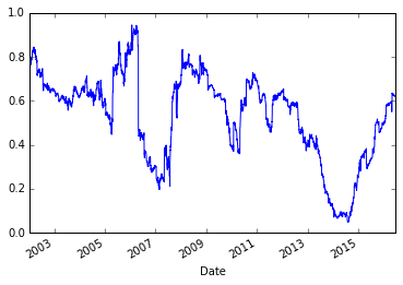
Those two graphs looked similar. Let’s plot them together
subplot(2,1,1)
pd.rolling_corr(aapl_rets, msft_rets, 250).plot()
title('Rolling correlations')
subplot(2,1,2)
model.beta['MSFT'].plot()
title('Least squaresn model')


    /opt/conda/envs/python2/lib/python2.7/site-packages/ipykernel/__main__.py:3: FutureWarning: pd.rolling_corr is deprecated for Series and will be removed in a future version, replace with
        Series.rolling(window=250).corr(other=<Series>)
      app.launch_new_instance()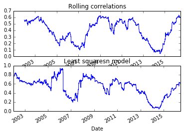
more stocks
There is all kinds of neat info on the web. Here is the SPY exchange-traded fund, which tracks the S&P 500 index.
px = web.get_data_yahoo('SPY')['Adj Close']*10
px

    Date
    2010-01-04     998.08658
    2010-01-05    1000.72861
    2010-01-06    1001.43318
    2010-01-07    1005.66052
    2010-01-08    1009.00712
    2010-01-11    1010.41626
    2010-01-12    1000.99287
    2010-01-13    1009.44749
    2010-01-14    1012.17761
    2010-01-15    1000.81670
    2010-01-19    1013.32249
    2010-01-20    1003.01842
    2010-01-21     983.73128
    2010-01-22     961.80210
    2010-01-25     966.73395
    2010-01-26     962.68278
    2010-01-27     967.26241
    2010-01-28     956.16569
    2010-01-29     945.77354
    2010-02-01     960.48105
    2010-02-02     972.10617
    2010-02-03     967.26241
    2010-02-04     937.40701
    2010-02-05     939.34454
    2010-02-08     932.56318
    2010-02-09     944.27638
    2010-02-10     942.42694
    2010-02-11     952.29063
    2010-02-12     951.49804
    2010-02-16     966.46975
                     ...
    2016-05-04    2050.09995
    2016-05-05    2049.70001
    2016-05-06    2057.20001
    2016-05-09    2058.89999
    2016-05-10    2084.49997
    2016-05-11    2065.00000
    2016-05-12    2065.59998
    2016-05-13    2047.59995
    2016-05-16    2067.79999
    2016-05-17    2048.50006
    2016-05-18    2049.10004
    2016-05-19    2041.99997
    2016-05-20    2054.90005
    2016-05-23    2052.10007
    2016-05-24    2078.69995
    2016-05-25    2092.79999
    2016-05-26    2093.39996
    2016-05-27    2102.40005
    2016-05-31    2098.39996
    2016-06-01    2102.70004
    2016-06-02    2109.10004
    2016-06-03    2102.79999
    2016-06-06    2113.50006
    2016-06-07    2116.79993
    2016-06-08    2123.69995
    2016-06-09    2120.80002
    2016-06-10    2100.70007
    2016-06-13    2084.49997
    2016-06-14    2080.39993
    2016-06-15    2077.50000
    Name: Adj Close, dtype: float64

plot(px)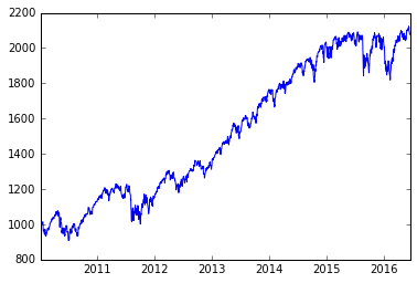
Scientific Computing in Python
This is a sample of doing some real scientific computing in Python.
We refer to some ideas in the book “Python for Scientists” by John M. Stewart. Specifically, we want to explore a numerical solver for ordinary differential equations (ODEs), called ODEint. This solver is based on lsoda, a Fortran package from Lawrence Livermore Labs that is a reliable workhorse for solving these difficult problems.
We look at four different ODEs that are interesting, and numerically challenging. They are:
- the harmonic oscillator (or linear pendulum)
- the non-linear pendulum
- the Lorenz equation, which is the model for chaotic behaviour
- the van der Pols equation, which is an example of a stiff ODE with periodic behaviour.
We do some basic tests of an ODE numerical solver, to test its accuracy, and to consider whether our asymptotic analysis of a pendulum is any good.
As in previous examples, we must start with code to tell the Notebook to plot items inline, and load in packages to do numerical computations (numpy), scientific computation (scipy) and plotting (matplotlib).
%matplotlib inline
import numpy as np
import matplotlib.pyplot as plt
from scipy.integrate import odeint # This is the numerical solver
We start with a second order linear equation, that has the usual harmonic oscillator solutions.
y''(t) + \omega^2 y(t) = 0, \qquad y(0) = 1, y'(0) = 0.
To put this into the numerical solver, we need to reformulate as a 2 dimensional, first order system: \mathbf{y} = (y,y')^T, \qquad \mathbf{y}'(t) = (y', -\omega^2 y)^T. Here is a simple code snippet that solves the problem numerically.
def rhs(Y,t,omega):  # this is the function of the right hand side of the ODE
    y,ydot = Y
    return ydot,-omega*omega*y

t_arr=np.linspace(0,2*np.pi,101)
y_init =[1,0]
omega = 2.0
y_arr=odeint(rhs,y_init,t_arr, args=(omega,))
y,ydot = y_arr[:,0],y_arr[:,1]
plt.ion()
plt.plot(t_arr,y,t_arr,ydot)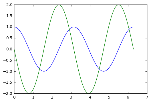
Let’s draw a phase portrait, plotting y and ydot together
plt.plot(y,ydot)
plt.title("Solution curve when omega = %4g" % omega)
plt.xlabel("y values")
plt.ylabel("ydot values")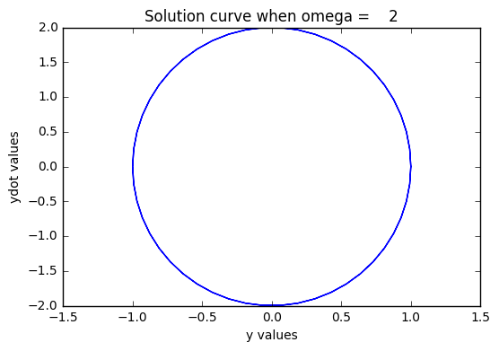
Now, I would like to test how accurate this numerical code is, by comparing the exact solution with the numerical solution. The exact solution is given by the initial values of y_init, and omega, and involves cosines and sines.
t_arr=np.linspace(0,2*np.pi,101)
y_init =[1,0]
omega = 2.0
y_exact = y_init[0]*np.cos(omega*t_arr) + y_init[1]*np.sin(omega*t_arr)/omega
ydot_exact = -omega*y_init[0]*np.sin(omega*t_arr) + y_init[1]*np.cos(omega*t_arr)
y_arr=odeint(rhs,y_init,t_arr, args=(omega,))
y,ydot = y_arr[:,0],y_arr[:,1]
plt.plot(t_arr,y,t_arr,y_exact)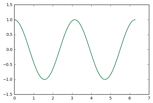
We plot the difference
plt.plot(t_arr,y-y_exact)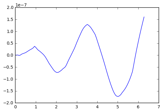
So, in the test I did above, we see an error that oscillates and grows with time, getting to about size 2x 10^(-7). Which is single precision accuracy.
Now, apparently ODEint figures out good step sizes on its own. Let’s try running the code again, with different number of steps in the t-variable.
numsteps=1000001  # adjust this parameter
y_init =[1,0]
omega = 2.0
t_arr=np.linspace(0,2*np.pi,numsteps)
y_exact = y_init[0]*np.cos(omega*t_arr) + y_init[1]*np.sin(omega*t_arr)/omega
ydot_exact = -omega*y_init[0]*np.sin(omega*t_arr) + y_init[1]*np.cos(omega*t_arr)
y_arr=odeint(rhs,y_init,t_arr, args=(omega,))
y,ydot = y_arr[:,0],y_arr[:,1]
plt.plot(t_arr,y-y_exact)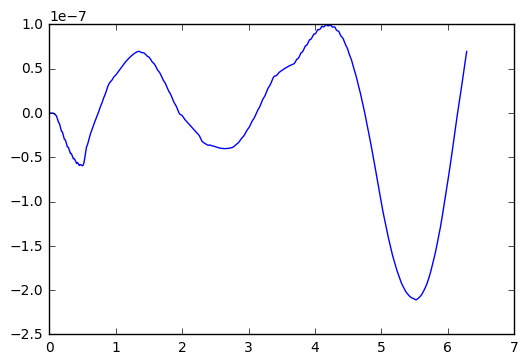
Okay, I went up to one million steps, and the error only reduced to about 1.0x10^(-7). Not much of an improvement.
Let’s try another experiment, where we go for a really long time. Say 100 time longer than the example above.
numsteps=100001  # adjust this parameter
y_init =[1,0]
omega = 2.0
t_arr=np.linspace(0,2*1000*np.pi,numsteps)
y_exact = y_init[0]*np.cos(omega*t_arr) + y_init[1]*np.sin(omega*t_arr)/omega
ydot_exact = -omega*y_init[0]*np.sin(omega*t_arr) + y_init[1]*np.cos(omega*t_arr)
y_arr=odeint(rhs,y_init,t_arr, args=(omega,))
y,ydot = y_arr[:,0],y_arr[:,1]
plt.plot(t_arr,y-y_exact)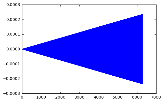
Interesting. My little test show the error grow linearly with the length of time. In the first time, 2x10^(-7). For 10 times longer, 2x10^(-6). For 100 times longer, 2x10^(-5). And so one.
A more subtle question: are these amplitude errors, or phase errors, or perhaps a combination?
p1=np.size(t_arr)-1
p0=p1-100
plt.plot(t_arr[p0:p1],y[p0:p1],t_arr[p0:p1],y_exact[p0:p1])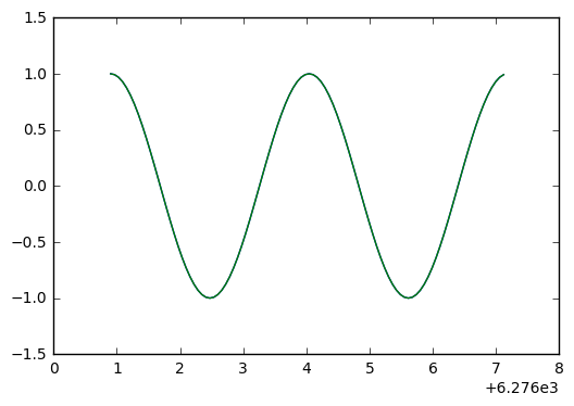
plt.plot(t_arr[p0:p1],y[p0:p1]-y_exact[p0:p1])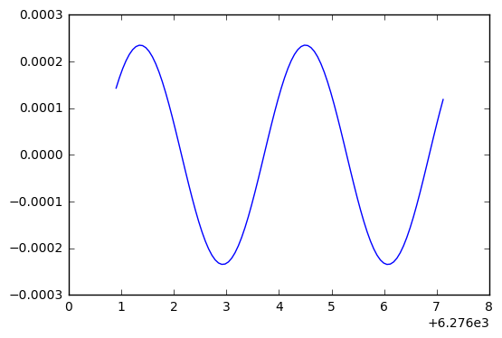
Ah ha! This looks like the negative derivative of the solution, which indicates we have a phase error. Because with phase error, we see the difference
\cos(t + \delta) - \cos(t) \approx -\delta\cdot \sin(t)
while with an amplitude error, we would see
(1+\delta)\cos(t) - \cos(t) \approx \delta\cdot \cos(t).
Let’s plot the soluton and the error difference, to see if the derivative zeros line up with peaks.
plt.plot(t_arr[p0:p1],y_exact[p0:p1],t_arr[p0:p1],3000*(y[p0:p1]-y_exact[p0:p1]))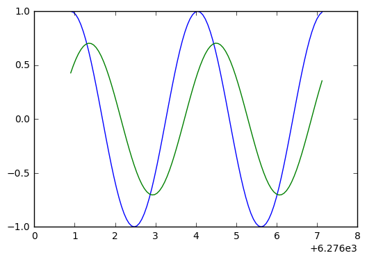
Looking at the above, we see they don’t quite line up. So a bit of phase error, a bit of amplitude error.
The non-linear pendulum
Well, it’s not to hard to generalize this stuff to the non-linear pendulum, where the restoring force has a sin(t) in it. We want to observe the period changes with the initial conditions (a bigger swing has a longer period).
The differential equation is:
y''(t) + \omega^2 \sin(y(t)) = 0, \qquad y(0) = \epsilon, y'(0) = 0.
To put this into the numerical solver, we need to reformulate as a 2 dimensional, first order system:
\mathbf{y} = (y,y')^T, \qquad \mathbf{y}'(t) = (y', -\omega^2 \sin(y))^T.
Here is a simple code snippet that solves the problem numerically.
def rhsSIN(Y,t,omega):  # this is the function of the right hand side of the ODE
    y,ydot = Y
    return ydot,-omega*omega*np.sin(y)

omega = .1   # basic frequency
epsilon = .5 # initial displacement, in radians (try 0 to .5)
velocity = 0 # try values from 0 to .2
t_arr=np.linspace(0,2*100*np.pi,1001)
y_init =[epsilon,velocity]

# we first set up the exact solution for the linear oscillator
y_exact = y_init[0]*np.cos(omega*t_arr) + y_init[1]*np.sin(omega*t_arr)/omega
ydot_exact = -omega*y_init[0]*np.sin(omega*t_arr) + y_init[1]*np.cos(omega*t_arr)
y_arr=odeint(rhsSIN,y_init,t_arr, args=(omega,))
y,ydot = y_arr[:,0],y_arr[:,1]
plt.ion()
plt.plot(t_arr,y,t_arr,y_exact)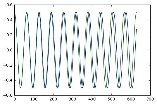
With epsilon = 0.1 (radians, which is about 5.7 degrees), it is hard to see a period shift. With epsilon = 0.5 (radians, which just under 30 degrees), we clearly see a shift after ten cycles of oscillation.
How big is the shift? Can we figure this out easily with numerics? And how does it compare with the estimate given by the Poincare-Lindstedt method?
It is kind of fun to set this up with epsilon = pi, which corresponds to an inverted pendulum. The pendulum sits upside down for a while, then slowly moves away from this unstable equilibrium point. The behaviour is very different than the linear harmonic oscillator. We show the example in the next cell.
omega = .1   # basic frequency
epsilon = np.pi+.0001 # initial displacement, in radians (try 0 to .5)
velocity = 0 # try values from 0 to .2
t_arr=np.linspace(0,2*100*np.pi,1001)
y_init =[epsilon,velocity]

# we first set up the exact solution for the linear oscillator
y_exact = y_init[0]*np.cos(omega*t_arr) + y_init[1]*np.sin(omega*t_arr)/omega
ydot_exact = -omega*y_init[0]*np.sin(omega*t_arr) + y_init[1]*np.cos(omega*t_arr)
y_arr=odeint(rhsSIN,y_init,t_arr, args=(omega,))
y,ydot = y_arr[:,0],y_arr[:,1]
plt.ion()
plt.plot(t_arr,y,t_arr,y_exact)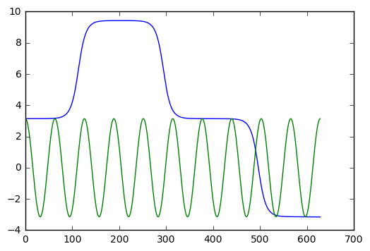
The Lorenz equation
You’ve probably heard of the butterfly effect (it’s even a movie). The idea is that weather can demonstrate chaotic behaviour, so that the flap of a butterfly wing in Brazil could eventually result in a tornado in Alabama.
Lorenz was studying a simplified model for weather, given by a system of three simple ODEs:
x' = \sigma(y-x), \quad y'=\rho x - y - xz, \quad z' = xy - \beta z
where x,y,z are functions of time, and \sigma, \rho,\beta are fixed constants.
When \rho is small, the behaviour is quite predictable. But when \rho gets better than about 24.7, you get strange, aperiodic behaviour.
Here is some code that demonstrates the behaviour. We also include 3D plots
def rhsLZ(u,t,beta,rho,sigma):
    x,y,z = u
    return [sigma*(y-x), rho*x-y-x*z, x*y-beta*z]

sigma = 10.0
beta = 8.0/3.0
rho1 = 29.0
rho2 = 28.8  # two close values for rho give two very different curves

u01=[1.0,1.0,1.0]
u02=[1.0,1.0,1.0]

t=np.linspace(0.0,50.0,10001)
u1=odeint(rhsLZ,u01,t,args=(beta,rho1,sigma))
u2=odeint(rhsLZ,u02,t,args=(beta,rho2,sigma))

x1,y1,z1=u1[:,0],u1[:,1],u1[:,2]
x2,y2,z2=u2[:,0],u2[:,1],u2[:,2]

from mpl_toolkits.mplot3d import Axes3D

plt.ion()
fig=plt.figure()
ax=Axes3D(fig)
ax.plot(x1,y1,z1,'b-')
ax.plot(x2,y2,z2,'r:')
ax.set_xlabel('x')
ax.set_ylabel('y')
ax.set_zlabel('z')
ax.set_title('Lorenz equations with rho = %g, %g' % (rho1,rho2))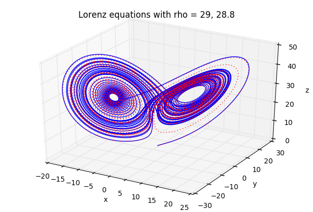
fig=plt.figure()
ax=Axes3D(fig)
ax.plot(x1,y1,z1)
ax.set_xlabel('x')
ax.set_ylabel('y')
ax.set_zlabel('z')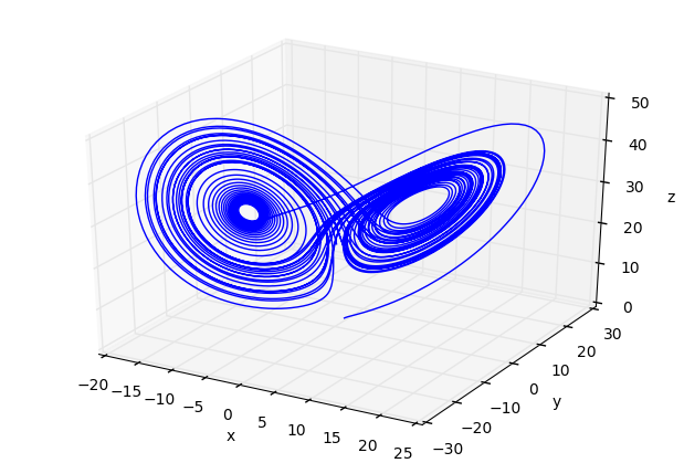
fig=plt.figure()
ax=Axes3D(fig)
ax.plot(x2,y2,z2)
ax.set_xlabel('x')
ax.set_ylabel('y')
ax.set_zlabel('z')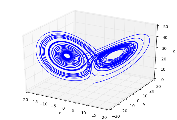
You should play around with the time interval (in the definition of varible t) to observe the predictable, followed by chaotic behaviour. ANd play with other parameters.
van der Pol equation
This equation is used as a testbed for numerical software. It is nonlinear, and collapses to a periodic orbit very quickly. We can include information about the Jacobian, the derivative of the vector function \mathbf{f} in the ODE system \mathbf{y}' = \mathbf{f}(\mathbf{y},t), into the ODE solver, to help it choose appropriate step sizes and reduce errors.
The van der Pol equation is this:
y'' - \mu(1-y^2)y' + y = 0
with the usual initial conditons for y(0), y'(0). In vector form, we write
\mathbf{y} = (y,y')^T, \qquad \mathbf{f}(\mathbf{y}) = (y', \mu(1-y^2)y' - y)^T.
The Jacobian is a 2x2 matrix of partial derivatives for \mathbf{f}, which is
\mathbf{J}(\mathbf{y}) = \left({\begin{array}{cc} 0 & 1 \\ -2\mu y y' - 1 & \mu(1-y^2) \end{array}}\right)
We set up the code as follows:
def rhsVDP(y,t,mu):
    return [ y[1], mu*(1-y[0]**2)*y[1] - y[0]]

def jac(y,t,mu):
    return [ [0,1], [-2*mu*y[0]*y[1]-1, mu*(1-y[0]**2)]]

mu=3 # adjust from 0 to 10, say
t=np.linspace(0,30,10001)
y0=np.array([2.0,0.0])
y,info=odeint(rhsVDP,y0,t,args=(mu,),Dfun=jac,full_output=True)

print("mu = %g, number of Jacobian calls is %d" % (mu, info['nje'][-1]))

plt.plot(t,y)
mu = 3, number of Jacobian calls is 0
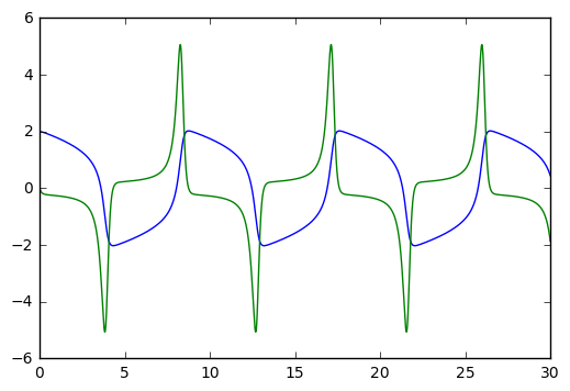
Try playing with the mu parameter. mu=0 gives the harmonic oscillator. mu=10 starts giving pointy spikes. For mu big, you might want to increase the range of to values, from [0,30] to a larger interval like [0,100]. Etc.
mu=10 # adjust from 0 to 10, say
t=np.linspace(0,30,10001)
y0=np.array([2.0,0.0])
y,info=odeint(rhsVDP,y0,t,args=(mu,),Dfun=jac,full_output=True)

print("mu = %g, number of Jacobian calls is %d" % (mu, info['nje'][-1]))

plt.plot(t,y)
mu = 10, number of Jacobian calls is 0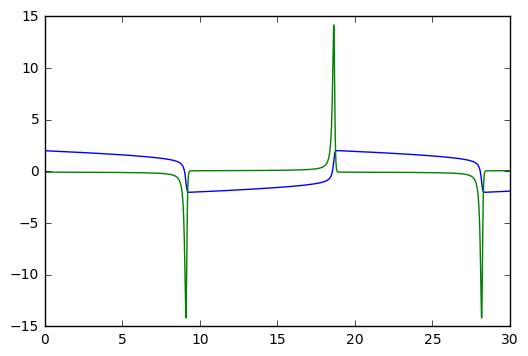
Audio Generation
With a few lines of code, we can produce sound and play it.
We will import a few tools to make this possible, including pylab for plotting and numerical work.
%matplotlib inline
from pylab import *
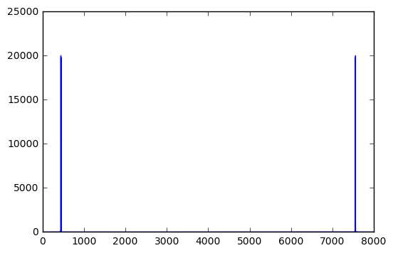
from IPython.display import AudioWe now set up five seconds of sound, sampled at 8000 times per second. We generate two pure tones together at 440 and 442 Hertz. This corresponds to a musical note at A above middle C. The slight difference in frequencies will cause a beating, or fluctuation of the sound at 2 beats per second.
Fs = 8000.0
Len = 5
t = linspace(0,Len,Fs*Len)
f1 = 442.0
f2 = 440.0
signal = sin(2*pi*f1*t) + sin(2*pi*f2*t)

Audio(data=signal, rate=Fs)We can analyse this signal with the Fourier transform. Plotting, we see the energy is concentrated need 440 Hz (and there is a mirror image in the frequency near 8000-440 Hz).
freqs = t*Fs/Len   # a list of frequencies, in Hertz
fsig = abs(fft(signal))  # Fourier transform of the signal
plot(freqs,fsig)  # amplitude versus frequency
[<matplotlib.lines.Line2D at 0x7fdb59e82358>]
By zooming in on the relevant part of the signal, we can see the presence of energy at the two frequencies of 440 Hz and 442 Hz.
plot(freqs[2100:2300],fsig[2100:2300])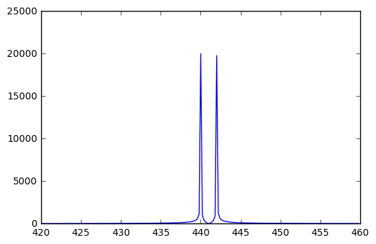
Some note on audio in the computer.
The sound we hear with our ears are the rapid vibrations of air pressure on our eardrums, usually generated from vibrations of some object like a guitar string, drum head, or the vocal cords of a human. These sounds are represented as a function of time. In the computer, we represent this function as a list of numbers, or samples, that indicate the value of the function at a range of time values.
Usually, we sample at uniform time intervals. In the example above, we have 8000 samples per second, for a length of 5 seconds. The Shannon sampling theorem tells us that we need to sample at least as fast as twice the highest frequency that we want to reproduce.
Humans with exceptional hearing can hear frequencies up to 20,000 Hz (20 kHz). This suggests we should sample at least at 40,000 samples per second for high quality audio. In fact, a compact disk is sampled at 44100 samples per second, and digital audio tapes at 48000 samples per second.
But, since computer speakers are often of lower quality, we typically sample at lower rates like 8000, 10000, or 22050 samples per second. That give sound that is “good enough” and saves on computer memory.
YouTube
With just a couple of lines, you can insert a YouTube video into your Jupyter notebook.
from IPython.display import YouTubeVideo
YouTubeVideo('kthi--SH2Nk')   # Counting to 100 in Cree
D3 and Games
d3 and fancy user interface
We can use a resource called d3 to great very complex user interfaces in a Notebook.
In this example, a cluster of balls is created that moves around as the computer mouse chases the balls, as displayed here. Click the picture to interact with the example.

This code was poached from here: https://github.com/skariel/IPython_d3_js_demo/blob/master/d3_js_demo.ipynb
There are three cells in this example. - the first cell creates a file, which has some html code and javascript to control the balls - the second cell defines Python functions that edie the file, to adjust the number of balls, etc. - the third cell calls the Python funciton f1 that launches the html and javascript.
Here is the first cell.
%%writefile f1.template
<!DOCTYPE html>
<html>
    <meta http-equiv="Content-Type" content="text/html;charset=utf-8"/>
    <script type="text/javascript" src="https://mbostock.github.io/d3/talk/20111018/d3/d3.js"></script>
    <script type="text/javascript" src="https://mbostock.github.io/d3/talk/20111018/d3/d3.geom.js"></script>
    <script type="text/javascript" src="https://mbostock.github.io/d3/talk/20111018/d3/d3.layout.js"></script>
    <style type="text/css">

circle {
  stroke: #000;
  stroke-opacity: .5;
}

    </style>
  <body>
    <div id="body">
    <script type="text/javascript">

var w = {width},
    h = {height};

var nodes = d3.range({ball_count}).map(function() { return {radius: Math.random() * {rad_fac} + {rad_min}}; }),
    color = d3.scale.category10();

var force = d3.layout.force()
    .gravity(0.1)
    .charge(function(d, i) { return i ? 0 : -2000; })
    .nodes(nodes)
    .size([w, h]);

var root = nodes[0];
root.radius = 0;
root.fixed = true;

force.start();

var svg = d3.select("#body").append("svg:svg")
    .attr("width", w)
    .attr("height", h);

svg.selectAll("circle")
    .data(nodes.slice(1))
  .enter().append("svg:circle")
    .attr("r", function(d) { return d.radius - 2; })
    .style("fill", function(d, i) { return color(i % {color_count}); });

force.on("tick", function(e) {
  var q = d3.geom.quadtree(nodes),
      i = 0,
      n = nodes.length;

  while (++i < n) {
    q.visit(collide(nodes[i]));
  }

  svg.selectAll("circle")
      .attr("cx", function(d) { return d.x; })
      .attr("cy", function(d) { return d.y; });
});

svg.on("mousemove", function() {
  var p1 = d3.svg.mouse(this);
  root.px = p1[0];
  root.py = p1[1];
  force.resume();
});

function collide(node) {
  var r = node.radius + 16,
      nx1 = node.x - r,
      nx2 = node.x + r,
      ny1 = node.y - r,
      ny2 = node.y + r;
  return function(quad, x1, y1, x2, y2) {
    if (quad.point && (quad.point !== node)) {
      var x = node.x - quad.point.x,
          y = node.y - quad.point.y,
          l = Math.sqrt(x * x + y * y),
          r = node.radius + quad.point.radius;
      if (l < r) {
        l = (l - r) / l * .5;
        node.x -= x *= l;
        node.y -= y *= l;
        quad.point.x += x;
        quad.point.y += y;
      }
    }
    return x1 > nx2
        || x2 < nx1
        || y1 > ny2
        || y2 < ny1;
  };
}

    </script>
  </body>
</html>
Here is the second cell.
from IPython.display import IFrame
import re

def replace_all(txt,d):
    rep = dict((re.escape('{'+k+'}'), str(v)) for k, v in d.items())
    pattern = re.compile("|".join(rep.keys()))
    return pattern.sub(lambda m: rep[re.escape(m.group(0))], txt)

count=0
def serve_html(s,w,h):
    import os
    global count
    count+=1
    fn= '__tmp'+str(os.getpid())+'_'+str(count)+'.html'
    with open(fn,'w') as f:
        f.write(s)
    return IFrame('files/'+fn,w,h)

def f1(w=500,h=400,ball_count=150,rad_min=2,rad_fac=11,color_count=3):
    d={
       'width'      :w,
       'height'     :h,
       'ball_count' :ball_count,
       'rad_min'    :rad_min,
       'rad_fac'    :rad_fac,
       'color_count':color_count
       }
    with open('f1.template','r') as f:
        s=f.read()
    s= replace_all(s,d)
    return serve_html(s,w+30,h+30)
Here is the third and final cell.
f1(ball_count=50, color_count=17, rad_fac=10, rad_min=3, w=600)